In this tutorial, you’ll learn essential Premiere Pro text tips to make your titles stand out. Get a primer on typography, the importance of font choice, and how to make it match the tone of your video. You’ll even learn a trick or two to inject some extra creativity into your titles, so the text in your next video does more than just convey information, it enhances the whole video too.
A picture’s worth a thousand words, but sometimes your video just needs some text. These Premiere Pro text enhancement tips will take your title game to the next level!
Summary
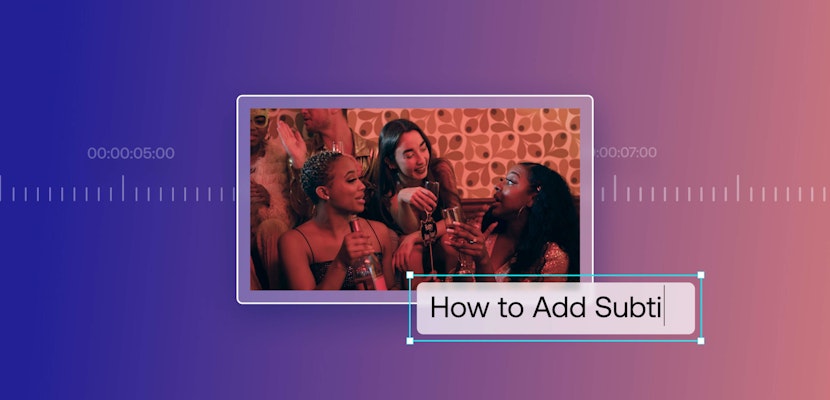
How To Make Text Look Better in Premiere Pro
Here are the five ways to make your text stand out. Visit this tutorial instead if you want to learn how to add text and titles in Premiere Pro CC.
1. Contrast
First of all, your text needs to have some contrast for people to be able to read it. For example, if you’re editing the background of a video with text or a logo using a yellow background with white text, it will be hard to read. So if you’re having trouble getting your text to be readable in the first place, here are some suggestions to help it stand out.
First of all, choose a text color and position within the frame so that whatever it’s up against, it will stand out. Dark against light, positioned in an area where over the whole duration of the text it can be read easily. It sounds simple, but it’s worth going over as it’s a quick fix.
Another simple fix is to blur the background with a simple Gaussian Blur. This way, the text is standing out more as it’s the only thing in focus. A more stylized version of this effect is to give a wash to footage with a particular color, leaving the text a neutral color (like white) to stand out.
Here’s how to do this:
- Add a solid color to your Project Manager by right-clicking and selecting new Color Matte.
- Choose the color that you’d like, and then place it over your footage, but under your text. This will create just a solid color as a background for your text.
- From here, you can play around with dropping the Opacity of the color matte, as well as changing the Blending Mode under Opacity in the Effect Control panel.
- You can incorporate this color layer to animate. The footage remains normal and then simply changes to make the text pop only when the text is present.
2. Typography
If you’re not confident, don’t mix fonts. A general rule of thumb in typography basics is not to use more than three different fonts. But it’s very possible to use no more than three, and still make them look gross. So what’s the solution?
If you don’t know how to mix fonts, stick to one, and build from there. It’s not that difficult to achieve variation while only using one font. By simply changing characteristics like size, font style, or even parameters like boldness and spacing, you can get nice titles, subtitles, or anything that your video calls for.
Start with one font and play around, see if you can make it look stylish, but more importantly, keep it cohesive!
3. Placement
When should you center text? When should it be a lower third? When do you have it off to the side? And how do you make that decision in the first place?
Size and location will typically dictate the importance of whatever is being displayed. If you make your text big and place it dead center, it’s going to look really important. Titles are an obvious example of this. Lower thirds, however, should be placed on the lower third and be smaller than the title.
In addition, if a title is to denote someone on screen the name of the person and their description isn’t as important as actually seeing them. The person takes priority over their information. You should also be careful when placing text over top of subjects or objects in your shot. If what’s happening is important, make sure it’s able to be seen.
If you’re moving your text out of the way of something, make sure it’s not going all the way to the edge of the frame. A great idea when working with text is to turn on safe margins.
Go to your program monitor, click on the Wrench icon, and select Safe Margins. You should see an outline of placements where your text should remain inside of. These margins ensure that no matter what device or situation your video is being viewed in, your text isn’t going to be cut off at the edges.
It used to be the standard for older TVs to have your text within the inner box, called Title Safe. It helped to ensure that your text would appear properly on the screen. But for modern times, just having it within the second box, called Action Safe, is a good rule of thumb. The corner of the action safe box is a nice-feeling spot to hold your lower thirds, as well.
4. Get Creative
If you want your text to be shown, but you’ve also got an important object in your footage that also needs to display, that’s when you can get creative! Try integrating your text into the scene by masking out the object to make it look like the text is actually behind it. You can learn more about using masks in this tutorial.
Some tips to keep in mind is to keep it short and simple. People want to watch your video, not read it. Your titles should be nice and short, even just one word. If you’ve got a complicated line that you need to present on the screen, you can still always find a way to widdle it down. Capture the core of whatever you’re saying in as few words as possible.
The only exception to this is kinetic typography because it’s movement is visually stimulating and makes it a part of the visual experience. So yeah, keep it short.
5. Tone
Always know the tone of your video! Make sure that your text supports the tone for each specific project you work on. If you’re making a serious, corporate video about a manufacturing plant, bright Comic Sans is not a good fit. Neither is Impact or Papyrus.
For professional videos, don’t choose a zany or flashy font. Opt for styles that are calm, cool, and collected. If your video is showing important products being built, you’ll also want to emphasize the text with some modern font.
A good rule of thumb for making your text feel modern is to choose a Sans Serif font. These are more angular fonts without those little notches and flares on the end. A Serif font, with all its flares, might serve you well in for a different video tone. For example, if you’re making a video all about a woodworker who creates custom acoustic guitars, talking about how things sounded better back in the good ole’ days.
The bottom line is don’t be hasty with these decisions. Test out a bunch of fonts, styles, and applications, and see what feels best. Know that you’re more likely to mess up by going too crazy rather than being more traditional.
Bonus Tip: Use Premiere Pro Text Templates!
When it comes to text, you don’t have to do everything from scratch. Motion Array has plenty of title templates to choose from. It’s a lot easier to make your text stand out when you’re starting with a great template!
_____
Hopefully, these Premiere Pro text tips have inspired you to try something new with your titles. Remember to take your time and get creative with different contrasts, fonts, placements, and combinations. It’s your video after all — you get the last word!