


No matter what type of video you shoot, there’s a good chance that it could benefit from some level of color correction. Maybe it’s just to even out your footage for consistency or maybe it’s to create an overall look and style.
Regardless of the reasoning for it, color correction is an art, and a subjective one at that. Two colorists could correct the same footage in totally different ways and be successful. But there are some general rules and techniques that will help you go a long way in creating good looking videos no matter what approach you take. Here are some of the fundamental concepts behind color and how to use them in your color correction session.
White Balance
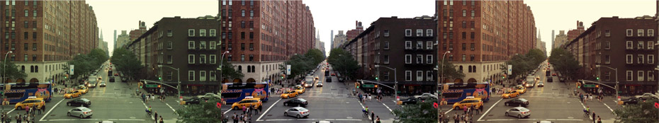
A great place to start is by making sure your footage is properly white balanced. This is something usually done within the camera on set. But sometimes mistakes get made and footage isn’t balanced correctly.
This means that places in your footage that should be pure white end up with a tint of one color or another.
Most editing software will have a simple white balance tool built in that will let you use a color picker to find something in your shot that should be white, and it will then properly white balance the footage accordingly.
This simple technique will make the rest of the correction process much easier.
Brightness & Contrast
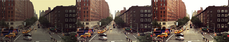
Brightness and contrast controls allow you to adjust how black or white your footage is overall and how much of a difference there is between the two.
When adjusting the brightness of a shot, you are controlling the overall black or white levels. By upping the brightness, the entire shot becomes more white and by bringing the brightness down, you will introduce more black. This tool is useful for helping to darken a shot that doesn’t have enough black in it or bringing up an under-lit shot. But be aware, that brightness adjustments can easily wash out or remove image details quickly.
The contrast control helps fix this by controlling the separation of the two. In other words, bringing your contrast up will make your whites brighter and your blacks darker at the same time. This is a very commonly used technique to bring out more detail in a shot and to enhance the drama of a scene. But remember that too much contrast will begin to look unnatural and can be harsh to the eye.
Work to adjust brightness and contrast to help you achieve good black and white levels in your shot without losing or overstating the details in the image.
Saturation
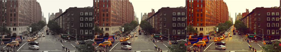
The amount of saturation in your shot affects how strongly your colors appear overall. In other words, if someone is wearing a red shirt, bringing up your saturation will make the shirt a more intense red and so on.
When working with flatly colored footage, adding saturation will enhance the vibrancy of the footage and make it pop more. This can be a useful way to “punch up” a shot or to add drama. It’s become popular to actually over-saturate footage to create a hyper real effect in movies and commercials.
But, be careful with adding saturation or intentionally over-saturating footage as colors will eventually look harsh to the eye, and at extreme levels, digital artifacting can take place, destroying the integrity of the footage altogether.
On the other hand, desaturation of an image will take out some of the color and can be used effectively for “vintage” effects and for a sense of emotional disconnection with the viewer.
Removing saturation altogether will leave you with a black and white image that can then be further tweaked with the brightness and contrast controls.
Hue
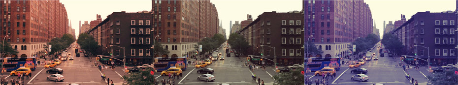
Hue represents the overall color tone of your footage. For instance, if your shot leans towards a blue hue, it will appear cooler in nature. Adjusting the hue to a more red tone will make the shot appear warmer in nature.
In most editing software, hue can be adjusted using a single color wheel or a 3-way color corrector that has separate color wheels for shadows, mid-tones, and highlights.
The color wheel can be thought of as two intersecting triangles of colors. At the corners of one triangle are red, green, and blue. The opposite triangle has cyan, magenta, and yellow.
A properly white-balanced video shouldn’t have a particular tint and the center dot of the color wheel represents white. If your shot has too much red in it, you can drag the dot in the opposite direction of the red towards cyan to counteract the red, and so forth.
These color wheels can be used as a way to even out footage that is tinted or to create a specific “look” that is tinted specifically for your needs. For instance, adjusting the hues towards deep blues will give your footage a wintery look throughout.
Another way to adjust hues along a specific axis in your footage is with the curves tool. Curves can be a little tricky to understand at first, but with practice, you can achieve great results.
Curves are generally broken down into individual channels for red, green, and blue, as well as an overall luminance channel. Taking the red channel as an example, before making any adjustments, the line on a curves graph will be a perfect diagonal from bottom left to top right. Clicking on the line will add a vertex that can then be shifted up or down to add more or take away red within a particular range in the luminance.
This technique gives you greater control of how you tint your footage or even it out within your shots.
These are just a few of the basics of understanding color correction. In future articles, we’ll go into further detail of some of the above techniques and explain scientific coloring tools like waveform monitors and vectorscopes.


