


Typography is a subtle art. Let’s face it, many of us are lucky to have just found Helvetica and made use of it over Comic Sans. It may not seem like a big deal, but making good use of typography, can really elevate the level of your graphics and videos.
Pairing the right fonts together, picking fonts that are appropriate for your design, and the proper use of spacing and size will all help your graphics go from average to amazing.
Summary
How to Improve Your Project’s Typography
Font Selection
There is no right or wrong font selection, but there are some important things to keep in mind when choosing fonts for your project.
Content
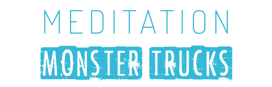
Think about exactly what it is that you are using your text for. A video on the joys of meditation won’t use the same fonts as a monster truck rally. Think about the overall look and attitude of the piece first when choosing fonts to work with.
Limit
One of the best ways to elevate your typography is to pair up fonts, but don’t overdo it. Ten different fonts will just cause confusion to the viewer who can’t make relationships between the text on screen.
Try starting with a couple of fonts, maybe add in different font weights and see how that works. You can always add another font selection later if you really need it.
Compliment
When matching fonts, try to use fonts that compliment each other, meaning that they feel natural together, but don’t pair fonts that look too similar. This will also cause confusion as the subtle differences may just look like a mistake.
A pairing of a chunky san serif font with a classic serif font may be perfect together. Check out sites like Just My Type for inspiration on font pairings.

Hierarchy
The concept of text hierarchy will come into play when we discuss sizing, but also consider it when working on font selection. You want to create a sense of hierarchy on screen where titles are larger than supporting text.
Consider this concept with font selection. Maybe use a bolder font for your titles with a lighter font for supporting text.
Resources
It’s great to have a wide variety of font choices to work with, although too many may cause font fatigue. Build a collection of fonts that you can make use of, and weed out ones over time that don’t get used. Think of it like cleaning your closet.
There are many great resources for purchasing commercial fonts online including Monotype, MyFonts, and Creative Market.
Free fonts are also available in abundance. FontSquirrel has an excellent collection of free to use commercial fonts and DaFont has an abundance of free font options.
Type Layout
There are many things to consider with type layout for your projects. As with any type of design, there are rules. And those rules can be broken once you know them. Start with the rules, then explore how to break them in creative ways.
Hierarchy
As we mentioned above, hierarchy plays an important role in typography. Hierarchy should lead your viewer from one piece of text to another. Naturally, their eye will be drawn to larger and bolder type first, so use that for titles and headers.
Work your way down the chain to the least important information in a natural flow that will take the viewer through the text the way you want.
Tracking
The amount of space between all of the letters in your type is called tracking. When working with larger amounts of type, tracking should stay fairly close so that words are easy to read, without being bunched together.
When working with titles and headers, design choices can be made to track tightly or widely. Sometimes mixing tracking between various fonts will lead to interesting results.
Kerning
Many people overlook kerning when it comes to type. We just assume that the font makers know what they are doing. Sometimes, this is the case and sometimes not.
Kerning is the process of properly spacing the letters within your individual words.
The important thing to remember with kerning that that you want similar spacing between each letter in a word. Whether your tracking is super tight or wide, space things evenly. Especially with titles and headers, take the time to individually kern each letter to have proper spacing.

Leading
While kerning and tracking deal with horizontal spacing, leading deals with vertical spacing in type.
The larger the leading, the further apart lines of type will be. Too much leading can lead to a disconnected feeling while tight leading may make larger amounts of text harder to read.
Try leading that separates different pieces of typography like titles, subtitles, and supporting text, but keeps related information close enough to have a natural reading flow for the viewer.
Respect The Font
When you choose a font that you like, remember that it was designed to look like that way. Some fonts come with various weights and styles to give you a vast array of options, but it’s best to not distort the fonts too much.
Stretching a font or squeezing it will likely make the font less appealing. If you choose a font that doesn’t fit because it’s too wide, look for a condensed font that is similar instead of squishing your choice into a messy version of itself.

Once you have a collection of fonts that you like working with and you know the rules of typography, you can really start to play with pairing and hierarchy decisions. Don’t be afraid to be creative, just remember that the number one reason for typography is to read something. If it can’t be read, it isn’t doing its job. Be creative but clear, and you’ll find your graphics will thank you for it.


